Saturday, 29 June 2013

Design Project - How Technology Affects Human

Summary

The world is changing. We have moved from the industrial age to the age of technology. In today’s world, technological advancements are measure in leaps and bounds. Take the military for example, smart weapons, remote aircrafts, body armors are just a tiny fraction of perks the military services are enjoying.
When people hear the word ‘military’, they think of war; when people hear the word ‘war’, first thing that pops into their mind is the notion of death and killing. On a side note, in most cultures, killing people is deemed to be an unethical behavior. However, there are of course exceptions to this with the historical human sacrificial offerings by the Mayans.
As a matter of fact, war is always going to exist. It is an inevitable and unfortunate fact of society – past, present, and future. Nevertheless, war should always be the last resort after all other means of diplomacy have failed.
During World War II, it took 108 B-17s dropping 648 bombs to destroy a target; more than 540 airmen’s lives were at stake just because of a single target. In the Vietnam War, a similar target required 176 bombs. These bombs were nonetheless inaccurate. Whether the bomb will hit the target depends on wind speed, weather, and velocity. Today, it only takes one plane and one pilot to destroy a similar target by using air missiles that can be fired from 100 miles away.
Collateral damage can be defined as damages of assets and personnel not considered as lawful military targets. Hence, bombing civilians, medical facilities, or other non-military targets it targets people who have no part in military conflict. In World War II, entire European cities were destroyed, causing more than 35 million non-combatants’ lives due to the slight attention given to collateral damage. Moreover, the two dropping of the atomic bombs on Hiroshima and Nagasaki yielded enormous collateral damage. These events are served as prime examples of how lack of advanced technology that limits collateral damage, can have devastating effects.
In brief, developing military technology is somewhat beneficial because more accurate weapons can lead to less collateral damage, hence decreasing the loss of innocent human lives.

Sketch


Step by step process

Step 1
Sketch and draw on a piece of A4 size paper. Scan it into the computer and open up drawing in photoshop. Resize picture to 423.5mm X 594.02mm and resolution of 300 pixels.

Step 2
Start off with the background. Using the gradient tool, colours: Pastel cyan & Orange, opacity at 50%, linear burn.

Step 3
Colour the skin of the guy's face on the left using the multiply mode.

Step 4
Colour the hair, glasses, head lights using the multiply mode.

Step 5
Colour the hat. Use magnetic lasso tool, filter à render à clouds (foreground: black; background: white)
Image à adjustments à levels, drag the left and the right corners to the centre so that they meet halfway
Select à color range à select the black colour and click 'OK', then paint it with darker green. Repeat the selection process, but this time select the white colour, then paint it with dark green.

Step 6
Colour the shirt using the same technique as Step 5

Step 7
Colour the bag straps and the country flag using the multiply mode.

Step 8
Colour the rifle. using linear burn, 85% gray, then 95% gray for the outline and details.

Step 9
Colour the helmet and the armour of the guy on the right using the multiply mode.

Step 10
The face and neck of the guy on the right were coloured using the multiply mode.

Step 11
The hair of the right guy was coloured using color mode.

Step 12
Tattoo was coloured using linear burn mode.

Step 13
Spear was coloured using the multiply mode.

Step 14
Hour glass was coloured. Several layer effects (Bevel & Emboss, Stroke, Inner Shadow, Inner Glow, Satin, and Drop Shadow) were used to create a glassy effect. The sand in the hour glass were coloured using the 'Dry brush tip light flow' brush.

Step 15
Gradient was changed to a mix a violet and pink with satin and gradient overlay effects.

Final Artwork
Final designed is displayed, together with signature and date.


Artist Statement
The basic idea of this art is to show time transition in terms of military across centuries. Ancient warrior and modern soldier. This depicts a huge change in military - from spears used by ancient warriors to rifles used by modern soldiers, heavy metal plated armours to light and durable body vests. Furthermore, their armours are also different. The modern body combat armours are built to camouflage the user and the user's weapon. The basic idea of camouflage comes from natural adaptations which allows animals to blend in with the environment. The hour glass represents the time transition across centuries, it also shows that the world is always changing, and that we need to constantly improve ourselves, keep ourselves updated with the latest technology as time will not turn back for us.

References
http://www.heritage.org/research/reports/2006/04/the-viability-of-directed-energy-weapons

Friday, 21 June 2013

How Technology Influenced Our Lives (Sketches)

Zombie kid with headphones on. A sign that most kids nowadays are turning into 'zombies' due to overexposure to technology.

Air pollution due to technology

Technology has created a communication barrier even when it comes to Thanksgiving Day.

We are feeding on technology and it is strangling us from the inside out, even our brains are slowly getting devoured by technology. 
This picture shows how technology has changed across centuries in terms of  military.


Friday, 14 June 2013

Sunday, 9 June 2013

Trip to National Art Gallery

The title of the art that I like the most is ‘Night Voyage’. Based on my interpretation of the art, it is like an adventure to the unknown, mysterious, adventurous sea. Imagine yourself standing at the head of the ship (like the one in the movie ‘Titanic’, where Jack holds Rose’s hand horizontally at the “You jump; I jump” part). You are staring down at a 60 degree angle. Ahead you can see dark skies which are very dark blue in colour; there are also some parts in the picture that has clear skies which are indicated by the yellow light. Overall, the picture has a very dark blue colour. On the bottom right of the picture you can see swirly waves made by the movement of the ship. The swirly waves are light blue and white in colour. Nearby ahead you can see a small boat that is abandoned. The small boat is apparently damaged (halved) and it is shaped like a butterfly. In brief, the message of this painting through my own interpretation is that although you are in a rough path in life now, but what lie ahead is your hope, your comfort zone, and all your dreams. All you have to do is endure the downs in life and your future will be secured.

“Everyone who achieves success in a great venture, solves each problem as they came to it. They helped themselves. And they were helped through powers known and unknown to them at the time they set out on their voyage. They keep going regardless of the obstacles they met.”

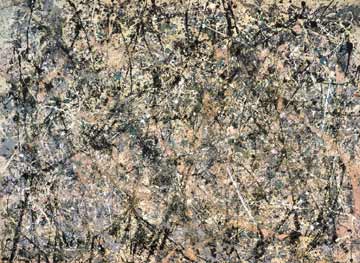
Art Movement - Abstract Expression

Abstract Expression

A painting movement in which artists typically applied paint rapidly, and with force to their huge canvases in an effort to show feelings and emotions, painting by gesture, non-geometrically, sometimes applying paint with large brushes, sometimes dripping or even throwing it onto canvas. Their work is characterized by a strong dependence on what appears to be accident and chance, but which is actually highly planned. Some Abstract Expressionist artists were concerned with adopting a peaceful and mystical approach to a purely abstract image. Usually there was no effort to represent subject matter. Not all work was abstract, nor was all work expressive, but it was generally believed that the spontaneity of the artists' approach to their work would draw from and release the creativity of their unconscious minds. The expressive method of painting was often considered as important as the painting itself. They were linked by a concern with varying degrees of abstraction used to convey strong emotional or expressive content. Abstract Expressionism has nonetheless been interpreted as an especially ‘American’ style because of its attention to the physical immediacy of paint; it has also been seen as a continuation of the Romantic tradition of the Sublime. It undeniably became the first American visual art to attain international status and influence.
Source: http://www.biddingtons.com/content/images/pollockautumn.jpg

Source: http://content.answcdn.com/main/content/img/webpics/abstract_expressionism_290.jpg
References

Friday, 7 June 2013

Photo that conveys a story.

Screenshot
Source: http://www.noupe.com/wp-content/uploads/2009/12/solider-story.jpg
This man is in his late thirties. He is a soldier that is fighting to protect his country and his people. He is a commander of his squad of 300 soldiers. He misses his beautiful wife and his five year old daughter dearly, and that is the only thing that is motivating him to move on; to survive this war and go back to his family. 

Alhough he is lucky to be alive, he had witnessed the deaths of many of his fellow comrades. Therefore he is also experiencing feelings of helplessness, loneliness, and distress. He is lying against the wall with his rifle that has protected him throughout the war, wondering whether if he will survive the brutality.
He is afraid that he will not make it out alive. Thus, he is thinking of what he would have done if he is not here; he is also reminiscing about the good memories in his life. The feeling of being missed and loved continues to stimulate him to endure the pain. In war, everything matters: your survival, the comrades’ survival, everything we do is life and death.

The moral of this story in brief is that we need to treasure the possessions in life that have important values toward us. We can then use these feelings to anchor away the negative emotions - the bad times. When it seems impossible to go on in life, it is the strength from loved ones that keeps us sane.
“No soldier outlives a thousand chances. But every soldier believes in Chance and trusts his luck.” 
― Erich Maria Remarque

Monday, 3 June 2013

Colour - RED

Colour

One of my favourite colour visible to the human eyes is Red. Red evokes strong emotions. Red is also the longest wavelength under the visible spectrum.  

After doing a quick research, the colour Red is the warmest colour of all. This is because Red is associated with fiery heat (passion), comfort and warmth. In addition, Red symbolizes danger. For example the colour Red on the streets means stop or danger (slow down). Furthermore, Red is also the colour of blood, which symbolizes vitality and life. A good example will be coloured video games. Usually the health in characters in games is represented by a red bar. It brings focus to the essence of life and living with emphasis of survival. Moreover, Red symbolizes love, passion, lust. For example, the common colour of rose is Red, and rose is the flower of love. Additionally, Red also increases one’s appetite. For example, most food and beverages company uses the colour Red as the background of their logo. We can evidently see this in McDonald’s, KFC, Coca-Cola, etc. On the contrary, the colour Red also has a negative side, as it can mean anger and temper. All in all, Red is used to stimulate the body, mind, and soul which increase circulation. Red evokes strong enthusiasm and interest, confidence to go after your dreams, and produces energy.

“I want to say something so embarrassing about September that even the leaves start blushing and turning red.” 
― Jarod Kintz

Souce: http://topnews.in/usa/files/red-1.jpg
Souce: http://a1.s6img.com/cdn/0007/p/1500947_9960643_lz.jpg
References

Principles of Design and Elements of Design

Principles of design
Principles of design are basic laws that are used to design anything. There are several principles of design which are the most fundamental concepts that underlie the field of design, and they are Balance, Proportion, Rhythm, Emphasis, and Unity.

Balance
  • -          Concept of visual equilibrium
  • -          Provides  stability and structure to a design
  • -          Judging balance against our ideas and physical structure (for instance mass, Gravity, or the sides of a page)
  • -          Usually comes with two forms: symmetrical and asymmetrical

Symmetrical balance (a.k.a. formal balance)
àhaving equal “weight” on equal sides of a centrally placed fulcrum
àelements arranged on equal sides = Bilateral symmetry
Source: http://www.scienceinschool.org/repository/images/issue2symmetry3.jpg
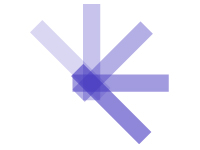
àelements arranged around the middle point = Radial symmetry
Source: https://blogger.googleusercontent.com/img/b/R29vZ2xl/AVvXsEgNQ7IIf8s_QGiFT6cYMt-pYfNbz3ULgN5DBiDhYo1r79LGiYRkiyyh0S8z64sMyH2KECV6RXwxZOOtfVJlGLNRI7ME_MABIc73rByKGsXzKz8TP0JRE1gubaj5mtDAgR6Myk8Zm0ECXnA/s1600/radial2.jpg
àsymmetry occurs using similar (but not identical) forms = Approximate symmetry
Source: http://char.txa.cornell.edu/language/principl/child.gif
àusing symmetry with one half inverted = Inverted symmetry 
Source: http://upload.wikimedia.org/wikipedia/commons/thumb/6/69/Studio_del_Corpo_Umano_-_Leonardo_da_Vinci.png/180px-Studio_del_Corpo_Umano_-_Leonardo_da_Vinci.png
àsymmetrical composition that has more than one axis of symmetry = Biaxial symmetry (two axes); tri-axial symmetry (three axes)
Biaxial Symmetry
Source: http://daphne.palomar.edu/design/symm/biax4.gif
Source: http://farm4.staticflickr.com/3031/2777975140_c03dfd86f5_n.jpg
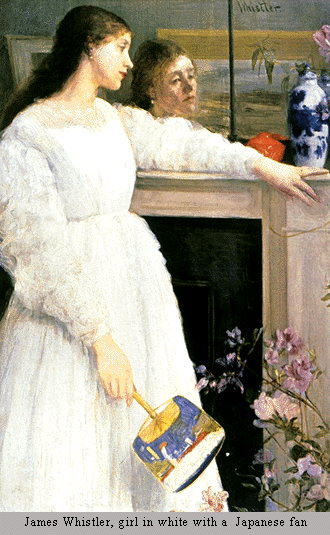
Asymmetrical balance (a.k.a. informal balance)
àmore complex and tougher to imagine
àoccurs when weight of object is not evenly distributed around a fulcrum point
àarranging objects in a way that they balance out each other using their respective visual weights
àusually dominant form offset by several smaller forms
àtends to give a greater sense of visual tension
àcareful adjustments in size, shape, color, and placement of the elements in the format
Assymetrical balance
Source: http://char.txa.cornell.edu/language/principl/whistl.gif
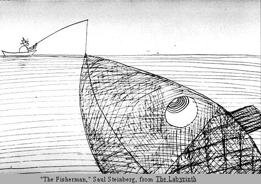
Proportion
  • -          Comparison of dimensions or distribution of forms
  • -          Relationships between objects, or parts, of a whole
  • -          When elements are designed with scale larger than life, it is used to show drama

Source: http://char.txa.cornell.edu/language/principl/fish.gif
Rhythm
  • -          Repetition or alternation of elements, often arranged in a meaningful motif
  • -          Creates predictability and order in a composition
  • -          Creates a sense of movement, and can establish pattern and texture

à Regular: intervals between the elements are similar in size or length.
Source: http://www.writedesignonline.com/resources/design/rules/Interrelatedforms.jpg
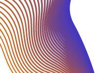
àFlowing: creates a sense of mobility, often more organic in nature
Source: http://learn.leighcotnoir.com/wp-content/uploads/2011/07/flowing_rhythm.jpg
àProgressive: a series of patterns through a progression of steps
Source: http://learn.leighcotnoir.com/wp-content/uploads/2011/07/progressive_rhythm.jpg

Emphasis/ Dominance
  • -          Point of focus which draws the viewers’ attention
  • -          Interruption that occurs in the basic flow of the viewer’s eyes through the break in rhythm
  • -          Usually there is a primary emphasis, secondary emphasis, and perhaps tertiary emphasis in a composition
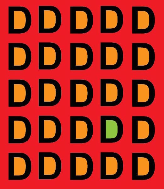
  • -          Repetition creates emphasis through repeated appearance of object (sheer force of numbers)
  • -          Contrast creates emphasis by setting apart the colour of the object and the colour of the background, sizes and scales works as well

Contrast
Souce: http://char.txa.cornell.edu/language/principl/rhythm/hopper.gif

Repetition
Source: http://char.txa.cornell.edu/language/principl/rhythm/mapemp.gif
Unity
  • -          Coherence of the whole, so that all parts are harmoniously working together to achieve a common goal
  • -          A concept that branched out from part of Gestalt theories of visual perception and psychology
  • -          Closure is the idea that the brain tends to fill in missing information when it perceives an object is missing some of its pieces
  • -          Continuance is the idea that once you begin looking in one direction you will continue to do so until something more significant catches your attention
  • -          Similarity, Proximity and Alignment is the idea that objects of similar size, shape, and colour tend to be grouped together by the brain, and a semantic relationship between the objects is formed. Items in close proximity to or aligned with each other tend to be grouped in similar way

Continuance
Source: http://www.digital-web.com/images/articles/principles_of_design_continuance.gif

Closure
Source: https://blogger.googleusercontent.com/img/b/R29vZ2xl/AVvXsEiCuD6bsd9rRXHuAZFGwPZ8WtdRmi-MRcvTwrIb9xZzoWMx_DucBxwiRSpdJNRVIPNfbG0VDW2aWLLuUrfdaOG6o7xqTTsLvqvQE48-aW6LSfJjhjHUmu0FrOebZMsZQWxhZj0mfa9XXg3i/s400/closure.jpg

Similarity
Souce: http://www.pedalo.co.uk/wp-content/uploads/2012/02/similarity.jpg

Elements of Design
Elements of design are components that are involved within making a design. There are several elements of design such as line, shape, colour, tone, texture, direction, size, and mass.

Line
  • -          Used to divide space, direct the vision, and create forms
  • -          Line is straight or curved, heavy or light, soft or hard or a mixture of them all.
  • -          Line can characterize a shape by being the edge of an area or surface, colour, tone or pattern – it becomes an outline or contour.
  • -          Line can show movement, suggest rhythm, create textural results, indicate emotional effects


Souce: http://www.sitepoint.com/wp-content/uploads/2009/10/LineTypes.png
Shape
  • -          Root of design
  • -          Used to establish layouts, create patterns, and build infinite elements
  • -          Can be bordered by a line, defined by colour, texture, or tone, suggest movement or emotions
  • -          Shape in 3D is called form
  • -          Can be sharp and clear or hazy and suggesting something
  • -          Shape can be negative or positive

Souce: https://blogger.googleusercontent.com/img/b/R29vZ2xl/AVvXsEj3Bi69tcwW7UO62TT9Z6DTf4mkZ-8ujMVc5bgVpaEiqokb7CwNt4oBMYMStsgPpi81d-4WmsgrlUlgAV985L-FwdJS1aP_1CC3bXw53FZ5qkMRmojOjzsdfesUr1AYziIQN4yd1WXhi2S2/s1600/kndnsk06.jpg
Colour
  • -          An element of design with unlimited variety
  • -          Can be applied to any other element, changing it intensely
  • -          Make images stand out, evoke emotions
  • -          3 primary colours: yellow, red, and blue
  • -          Diferent colours can be made by changing the amount of primary colours used
  • -          Has temperature. Reds and oranges feel warm; blues and greens feel cooler
  • -          Intensity of colour is its concentration and purity
  • -          Hue is the quality that separates one colour from the other
  • -          Tone value is the degree of lightness or darkness of a colour. Yellow is light; blue is dark
  • -          Tints are made by adding white to a colour
  • -          Shades are made by adding black to a colour
  • -          Analogous colours are hues lying near each other on the colour wheel, red-orange, red-purple. 
  • -          Complimentary colurs are hues opposite each other on the colour wheel, red and green, purple and yellow.
  • -          Discord is where opposite colours are together and one is a tint, so that the original tone of the hue is different.

Source: https://blogger.googleusercontent.com/img/b/R29vZ2xl/AVvXsEjRWpQqCYjuz4EWM5bZUrKtzJowZWEaeJ3Qvo64TuS6n5TuLBtowM86zrHfDHF1FcHwsu-L5xJxWKg7UuWXHDhvPyjrCwnbFlbFrfD2QTMG3f4p0bdp5NHbQvfOnsbSZT-N9qBKOdT6rHA/s1600/colours..bmp
Tone
  • -          Light and dark. Light reveals, shows the world to us, and shadow gives meaning to the things we see.
  • -          Gives solidity, volume and weight to an image
  • -          Gives the impression of distance. Darker tones come forward and lighter tones go back into the image.
  • -          Gives emotion to an image. Highly contrasting tones give life and energy; softer tones give a gentle mood.
  • -          Create rhythm, with the eyes jumping from one dark tone to another.
  • -          The property of colour. Yellow is light, blue is dark.
  • -          In sculpture is the way it catches the light, so that sharp changes are made by deep corners, and gentle ones by smooth gradual changes.

Souce: http://www.underworldmagazines.com/wp-content/uploads/2011/05/unity.jpg
Texture
  • -          Surface of a design or visual appearance of a design
  • -          Able to feel, making it unique from other elements of design
  • -          Can be rough, smooth, spiky, soft, velvety, regular, or irregular
  • -          Able to suggest emotions by linking with the memory of how things feel
Souce: http://www.mccullagh.org/db9/1ds2-4/honeycomb-texture.jpg
Direction
  • -          Is about how our eyes move around the artwork.
  • -          Can be horizontal, vertical, curved, sloped or straight.
  • -          Can suggest movement by the speed at which it is changed. 
  • -          Can be balanced to give stability or imbalanced to give tension
  • -          Can have an emotional impact. Using rapid changes in direction or use of diagonals can cause anxiety while horizontals and verticals bring about calm.

Souce: http://s3images.coroflot.com/user_files/individual_files/original_327005_mW5f5VfU2ckJcuwr2vQ2kEIDz.gif
Size
  • -          Is about the bigness or smallness of an area.
  • -          Can give space, it can make closer objects appear larger and make distant objects appear smaller.
  • -          Can be given by comparing one element that is larger or smaller than the other.
  • -          Can make a particular element look important.

Souce: http://tgj4m-blkd.wikispaces.com/file/view/PACMAN-animation.gif/258330760/PACMAN-animation.gif

Mass
  • -          Is the amount of material in any sculptural work.
  • -          Can be suggested in a painting or drawing.
  • -          Can be heavy or light in effect.
  • -          Space or void refers to the lack of mass.

Souce: http://www.vanseodesign.com/blog/wp-content/uploads/2010/07/mass1.png
References