Principles of design
Principles of design are basic
laws that are used to design anything. There are several principles of design
which are the most fundamental concepts that underlie the field of design, and
they are Balance, Proportion, Rhythm, Emphasis, and Unity.
Balance
- - Concept of visual equilibrium
- - Provides stability and structure to a design
- - Judging balance against our ideas and physical structure (for instance mass, Gravity, or the sides of a page)
- - Usually comes with two forms: symmetrical and asymmetrical
Symmetrical
balance (a.k.a. formal balance)
àhaving equal “weight” on equal sides of a centrally placed fulcrum
àelements arranged on equal sides = Bilateral symmetry
àhaving equal “weight” on equal sides of a centrally placed fulcrum
àelements arranged on equal sides = Bilateral symmetry
 |
| Source: http://www.scienceinschool.org/repository/images/issue2symmetry3.jpg |
àelements
arranged around the middle point = Radial
symmetry
 |
| Source: https://blogger.googleusercontent.com/img/b/R29vZ2xl/AVvXsEgNQ7IIf8s_QGiFT6cYMt-pYfNbz3ULgN5DBiDhYo1r79LGiYRkiyyh0S8z64sMyH2KECV6RXwxZOOtfVJlGLNRI7ME_MABIc73rByKGsXzKz8TP0JRE1gubaj5mtDAgR6Myk8Zm0ECXnA/s1600/radial2.jpg |
àsymmetry
occurs using similar (but not identical) forms = Approximate symmetry
 |
| Source: http://char.txa.cornell.edu/language/principl/child.gif |
àusing
symmetry with one half inverted = Inverted
symmetry
 |
| Source: http://upload.wikimedia.org/wikipedia/commons/thumb/6/69/Studio_del_Corpo_Umano_-_Leonardo_da_Vinci.png/180px-Studio_del_Corpo_Umano_-_Leonardo_da_Vinci.png |
àsymmetrical
composition that has more than one axis of symmetry = Biaxial symmetry
(two axes); tri-axial symmetry
(three axes)
 |
| Biaxial Symmetry Source: http://daphne.palomar.edu/design/symm/biax4.gif |
 |
| Source: http://farm4.staticflickr.com/3031/2777975140_c03dfd86f5_n.jpg |
Asymmetrical
balance (a.k.a. informal balance)
àmore complex and tougher to imagine
àoccurs when weight of object is not evenly distributed around a fulcrum point
àarranging objects in a way that they balance out each other using their respective visual weights
àusually dominant form offset by several smaller forms
àtends to give a greater sense of visual tension
àcareful adjustments in size, shape, color, and placement of the elements in the format
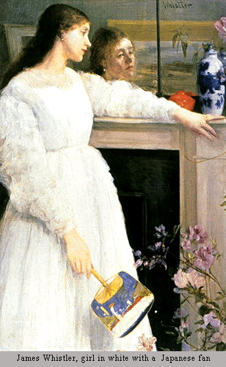 |
| Assymetrical balance Source: http://char.txa.cornell.edu/language/principl/whistl.gif |
Proportion
- - Comparison of dimensions or distribution of forms
- - Relationships between objects, or parts, of a whole
- - When elements are designed with scale larger than life, it is used to show drama
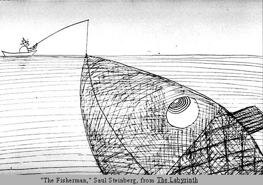 |
| Source: http://char.txa.cornell.edu/language/principl/fish.gif |
Rhythm
- - Repetition or alternation of elements, often arranged in a meaningful motif
- - Creates predictability and order in a composition
- - Creates a sense of movement, and can establish pattern and texture
à Regular:
intervals between the elements are similar in size or length.
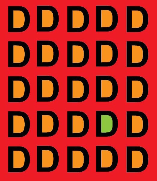 |
| Source: http://www.writedesignonline.com/resources/design/rules/Interrelatedforms.jpg |
àFlowing: creates a sense of mobility, often more organic in
nature
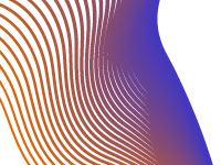 |
| Source: http://learn.leighcotnoir.com/wp-content/uploads/2011/07/flowing_rhythm.jpg |
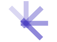
àProgressive:
a series of patterns through a progression of steps
 |
| Source: http://learn.leighcotnoir.com/wp-content/uploads/2011/07/progressive_rhythm.jpg |
Emphasis/ Dominance
- - Point of focus which draws the viewers’ attention
- - Interruption that occurs in the basic flow of the viewer’s eyes through the break in rhythm
- - Usually there is a primary emphasis, secondary emphasis, and perhaps tertiary emphasis in a composition
- - Repetition creates emphasis through repeated appearance of object (sheer force of numbers)
- - Contrast creates emphasis by setting apart the colour of the object and the colour of the background, sizes and scales works as well
 |
| Contrast Souce: http://char.txa.cornell.edu/language/principl/rhythm/hopper.gif |
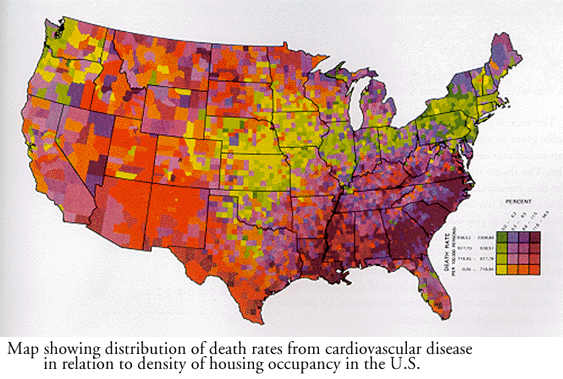 |
| Repetition Source: http://char.txa.cornell.edu/language/principl/rhythm/mapemp.gif |
Unity
- - Coherence of the whole, so that all parts are harmoniously working together to achieve a common goal
- - A concept that branched out from part of Gestalt theories of visual perception and psychology
- - Closure is the idea that the brain tends to fill in missing information when it perceives an object is missing some of its pieces
- - Continuance is the idea that once you begin looking in one direction you will continue to do so until something more significant catches your attention
- - Similarity, Proximity and Alignment is the idea that objects of similar size, shape, and colour tend to be grouped together by the brain, and a semantic relationship between the objects is formed. Items in close proximity to or aligned with each other tend to be grouped in similar way
 |
| Continuance Source: http://www.digital-web.com/images/articles/principles_of_design_continuance.gif |
 |
| Closure Source: https://blogger.googleusercontent.com/img/b/R29vZ2xl/AVvXsEiCuD6bsd9rRXHuAZFGwPZ8WtdRmi-MRcvTwrIb9xZzoWMx_DucBxwiRSpdJNRVIPNfbG0VDW2aWLLuUrfdaOG6o7xqTTsLvqvQE48-aW6LSfJjhjHUmu0FrOebZMsZQWxhZj0mfa9XXg3i/s400/closure.jpg |
 |
| Similarity Souce: http://www.pedalo.co.uk/wp-content/uploads/2012/02/similarity.jpg |
Elements of Design
Elements of design are components
that are involved within making a design. There are several elements of design
such as line, shape, colour, tone, texture, direction, size, and mass.
Line
- - Used to divide space, direct the vision, and create forms
- - Line is straight or curved, heavy or light, soft or hard or a mixture of them all.
- - Line can characterize a shape by being the edge of an area or surface, colour, tone or pattern – it becomes an outline or contour.
- - Line can show movement, suggest rhythm, create textural results, indicate emotional effects
 |
| Souce: http://www.sitepoint.com/wp-content/uploads/2009/10/LineTypes.png |
Shape
- - Root of design
- - Used to establish layouts, create patterns, and build infinite elements
- - Can be bordered by a line, defined by colour, texture, or tone, suggest movement or emotions
- - Shape in 3D is called form
- - Can be sharp and clear or hazy and suggesting something
- - Shape can be negative or positive
 |
| Souce: https://blogger.googleusercontent.com/img/b/R29vZ2xl/AVvXsEj3Bi69tcwW7UO62TT9Z6DTf4mkZ-8ujMVc5bgVpaEiqokb7CwNt4oBMYMStsgPpi81d-4WmsgrlUlgAV985L-FwdJS1aP_1CC3bXw53FZ5qkMRmojOjzsdfesUr1AYziIQN4yd1WXhi2S2/s1600/kndnsk06.jpg |
Colour
- - An element of design with unlimited variety
- - Can be applied to any other element, changing it intensely
- - Make images stand out, evoke emotions
- - 3 primary colours: yellow, red, and blue
- - Diferent colours can be made by changing the amount of primary colours used
- - Has temperature. Reds and oranges feel warm; blues and greens feel cooler
- - Intensity of colour is its concentration and purity
- - Hue is the quality that separates one colour from the other
- - Tone value is the degree of lightness or darkness of a colour. Yellow is light; blue is dark
- - Tints are made by adding white to a colour
- - Shades are made by adding black to a colour
- - Analogous colours are hues lying near each other on the colour wheel, red-orange, red-purple.
- - Complimentary colurs are hues opposite each other on the colour wheel, red and green, purple and yellow.
- - Discord is where opposite colours are together and one is a tint, so that the original tone of the hue is different.
 |
| Source: https://blogger.googleusercontent.com/img/b/R29vZ2xl/AVvXsEjRWpQqCYjuz4EWM5bZUrKtzJowZWEaeJ3Qvo64TuS6n5TuLBtowM86zrHfDHF1FcHwsu-L5xJxWKg7UuWXHDhvPyjrCwnbFlbFrfD2QTMG3f4p0bdp5NHbQvfOnsbSZT-N9qBKOdT6rHA/s1600/colours..bmp |
Tone
- - Light and dark. Light reveals, shows the world to us, and shadow gives meaning to the things we see.
- - Gives solidity, volume and weight to an image
- - Gives the impression of distance. Darker tones come forward and lighter tones go back into the image.
- - Gives emotion to an image. Highly contrasting tones give life and energy; softer tones give a gentle mood.
- - Create rhythm, with the eyes jumping from one dark tone to another.
- - The property of colour. Yellow is light, blue is dark.
- - In sculpture is the way it catches the light, so that sharp changes are made by deep corners, and gentle ones by smooth gradual changes.
 |
| Souce: http://www.underworldmagazines.com/wp-content/uploads/2011/05/unity.jpg |
Texture
- - Surface of a design or visual appearance of a design
- - Able to feel, making it unique from other elements of design
- - Can be rough, smooth, spiky, soft, velvety, regular, or irregular
- - Able to suggest emotions by linking with the memory of how things feel
 |
| Souce: http://www.mccullagh.org/db9/1ds2-4/honeycomb-texture.jpg |
Direction
- - Is about how our eyes move around the artwork.
- - Can be horizontal, vertical, curved, sloped or straight.
- - Can suggest movement by the speed at which it is changed.
- - Can be balanced to give stability or imbalanced to give tension
- - Can have an emotional impact. Using rapid changes in direction or use of diagonals can cause anxiety while horizontals and verticals bring about calm.
 |
| Souce: http://s3images.coroflot.com/user_files/individual_files/original_327005_mW5f5VfU2ckJcuwr2vQ2kEIDz.gif |
Size
- - Is about the bigness or smallness of an area.
- - Can give space, it can make closer objects appear larger and make distant objects appear smaller.
- - Can be given by comparing one element that is larger or smaller than the other.
- - Can make a particular element look important.
 |
| Souce: http://tgj4m-blkd.wikispaces.com/file/view/PACMAN-animation.gif/258330760/PACMAN-animation.gif |
Mass
- - Is the amount of material in any sculptural work.
- - Can be suggested in a painting or drawing.
- - Can be heavy or light in effect.
- - Space or void refers to the lack of mass.
 |
| Souce: http://www.vanseodesign.com/blog/wp-content/uploads/2010/07/mass1.png |
References
No comments:
Post a Comment